Case practice of Simon Stålenhag - Things from the Flood
I've been wanting to dive into 3D modelling and texturing for a while and I've always loved Simon Stålenhag, so I took the leap and decided to model something from one of his illustrations. Had to take a few creative liberties and there's a thousand things I'd like to do better next (I'm looking at you, bevels and surface normals), but I had a lot of fun with it!
Might do the whole scene from the original artwork in 3D at some point, I'd love to try my hands on modelling the interior as well. All around really interesting challenge - I highly recommend you check out his work if you like this kind of style, thanks for inspiring the rest of us! :)
THINGS TO IMPROVE FOR NEXT PIECE:
- Better style consistency (see legs vs feet, rounder plates).
- Better surface normals and edges (wider bevels).
- Better material transitions on meshes that are part of the same surface (see black/white coloring on plate bottoms).
- Better overall presentation when shooting for portfolio (focal length, camera position, lighting, background).
- Better awareness for the purpose of piece (okay to go high poly if it's not a game asset).

Orthographic

A floaty mcboat, great for hauling alien machine debris out of the local lake

Legs for days
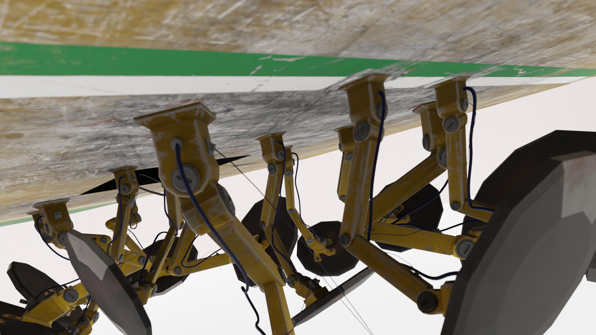
Played around with normal-maps around the leg attachment points, particularly where the paint streaks come across

Had to extract and draw over the logo to recreate it in high-res. I never tried calling the number though, lol

Door smudges and stuff

I messed up some overall proportions so it was hard to match the paint stripes all the way around, turned them into arrows instead :)

I IK-rigged the legs to make them easy to pose

Voilá

Material ID map kind of looks like a Lego submarine

Symmetricaaaaaaaaal!

Thank goodness I like naming things, I need an extra monitor just for the scene outliner